
The Product Detail View
The product detail view is the full picture of a single product: its photos, every size in the style, pricing, live inventory, and all of its specifications. It opens right on top of whatever you’re looking at, so you never lose your place.
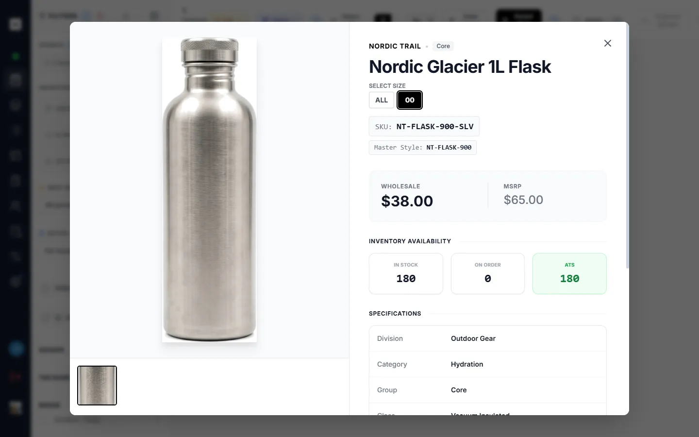
Opening the detail view
Section titled “Opening the detail view”Click any product card in the Catalogue, or any product row in the Catalogue’s list view, to open its detail view. It works the same everywhere a product appears — inside a list, in search results, or in a filtered grid. Close it with the ✕ in the top corner or by clicking outside the panel; you return to exactly where you were.
If you opened a parent card (a style with several variants), the detail view opens on the style as a whole. Use the Select Size row (see Choosing a size below) to drop into a specific variant.
The image gallery
Section titled “The image gallery”The left side of the view is the product’s photo gallery.
- Thumbnails run alongside the main image. Click one to make it the main shot.
- Full-screen viewer — click the main image to expand it to fill your screen for a closer look. Click again (or press Escape) to come back.
Photos borrowed from a sibling variant
Section titled “Photos borrowed from a sibling variant”A variant that has no photos of its own can display photos from another variant in the same style and colour. This keeps your grid and detail views from showing blank cards when only one variant in a colourway was photographed. When this happens, the detail view marks the images as borrowed so you know they belong to a sibling rather than the exact SKU you’re viewing.
This behavior is on by default and can be turned off for the whole workspace by a Super Admin — the highest account role, which sits above a regular admin.
Choosing a size
Section titled “Choosing a size”In the detail view, above the pricing and inventory, the Select Size row lets you move between the variants that make up the style:
- Pick a specific size to view that exact variant — its SKU, pricing, and inventory update to match.
- Pick ALL for the rolled-up view of the whole style. Inventory and pricing then reflect the style as a whole rather than a single size.
Switching sizes never closes the view; it just re-points everything below it at the size you chose.
SKU and Master Style
Section titled “SKU and Master Style”Two identifiers sit just under the product name:
- SKU — the unique code for the exact variant you’re viewing. This is what changes as you switch sizes.
- Master Style — the shared style code that ties all of a product’s variants (sizes and colours) together. It stays the same no matter which size you select.
Wholesale and MSRP
Section titled “Wholesale and MSRP”Pricing shows two figures side by side:
- Wholesale — the trade price you sell to buyers at.
- MSRP — the suggested retail price.
(Your workspace may have renamed these labels — an admin can rename built-in field labels, so you might see “Trade Price” or similar. See Settings & Personalization.)
Inventory availability
Section titled “Inventory availability”Three tiles summarize what you can sell:
| Tile | Meaning |
|---|---|
| In Stock | Units physically on hand right now. |
| On Order | Units already on their way in (inbound / not yet arrived). |
| ATS | Available To Sell — the quantity you can actually commit to a buyer. |
ATS is the number to trust when you’re taking an order: it’s what’s genuinely available to promise, rather than a raw stock count. In the rolled-up ALL view, these tiles total across every size in the style; on a single size, they show just that variant.
For deeper stock planning, forecasting, and open-order coverage, see Inventory & Planning.
Specifications and other sections
Section titled “Specifications and other sections”Below inventory, the Specifications table lists the product’s fields — division, category, group, class, and the rest of its attributes. Depending on how your workspace has set up the detail view, you may also see:
- A description section with longer product copy.
- Product custom fields — extra attributes your workspace defined for every product. (These appear as admin-only sections.)
- Tags and banners (below).
Tags and banners
Section titled “Tags and banners”Tags and banners are labels your team applies to products — for merchandising, campaigns, or internal flags. They can be set at the individual-product level or at the whole-style level, and both apply when you view a product. They also drive filtering back in the Catalogue.
Editing list custom-field values
Section titled “Editing list custom-field values”When you open a product from inside a list that has its own custom fields, you can edit those field values right here in the detail view — no spreadsheet needed.
- Type into a field and your change saves automatically a moment after you stop typing. Clearing a field removes that value.
- Who can edit: you need edit access to that list and at least a User account role. Viewers can read the values but can’t change them. (Admins can always edit.)
- Editing works on individual variants. In the rolled-up ALL view, list custom fields are shown for reference only — switch to a specific size to edit.
For how these fields are created and managed, see Custom Fields and Sharing & List Tools.
Choosing which sections appear
Section titled “Choosing which sections appear”The detail view’s right-hand panel is fully arrangeable through Modal Layouts:
- Company-wide layout (admins only): an admin designs which sections appear and in what order for the whole workspace, from Admin Setup → Modal Layouts. This becomes everyone’s default.
- Personal layout: each user can pick or build their own layout under Settings → Modal Layouts, which overrides the company default just for them.
If no custom layout is set, the detail view falls back to a sensible built-in arrangement — header, pricing, inventory, specifications, and so on.