
Line Sheets
The Line Sheet Builder turns a product list into a paginated, print-ready document with full control over layout, styling, grouping, and branding. What you arrange on screen is exactly what exports — the same pages, fonts, group headers, and subtotals.
Opening the builder
Section titled “Opening the builder”You can open the builder two ways:
- Open the Line Sheet module from the navigation sidebar (see Getting Started) and pick a list, or
- Click Generate Line Sheet from inside any open list (see Sharing & List Tools).
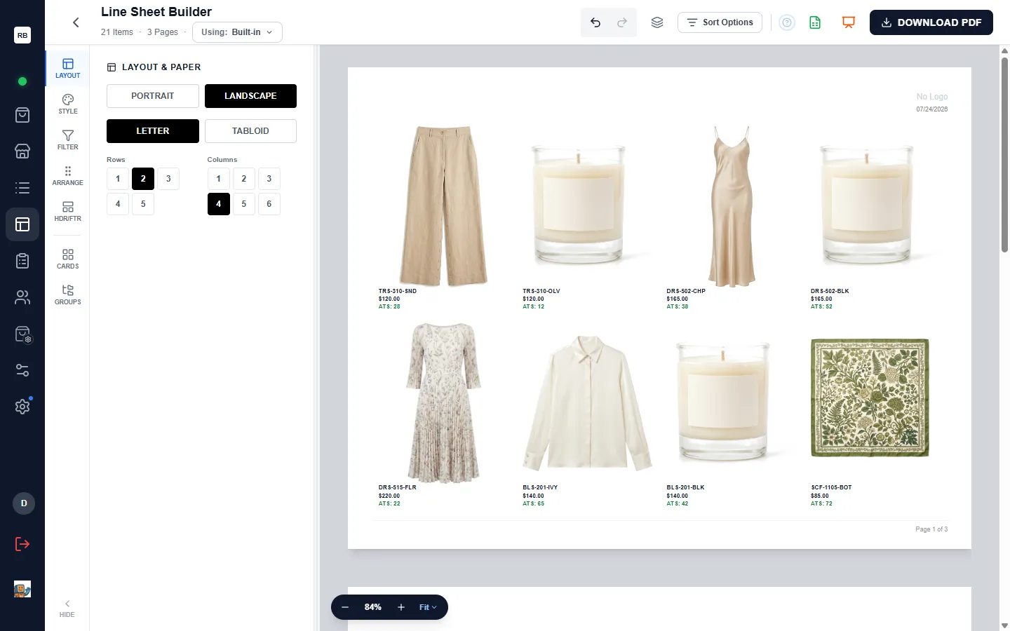
Either way, the builder loads that list’s products into a live, page-by-page preview. Every change you make updates the preview immediately.
The top bar
Section titled “The top bar”The bar across the top holds the document-wide controls:
- Item and page counts — how many products the sheet contains and how many pages it currently spans, updated as you filter, group, or change the layout. When the sheet is grouped, a group count appears here too.
- Preset indicator — a pill showing which saved layout is active (for example an organization preset shows as Organization ·
). Click it to switch layouts or save a new one — see Presets. - Undo / Redo — step backward and forward through your changes (also
Ctrl+ZandCtrl+Shift+Z). - Parent View — combine each master style and color onto one card, so each card is a whole colorway rather than one card per individual size. Turn it off to show one card per variant. Fields and subtotals adjust to whichever view is active.
- Sort Options — opens the sort menu (below).
- Downloads — export buttons for Excel, PowerPoint (PPTX), and Download PDF. See Exporting.
Sort Options
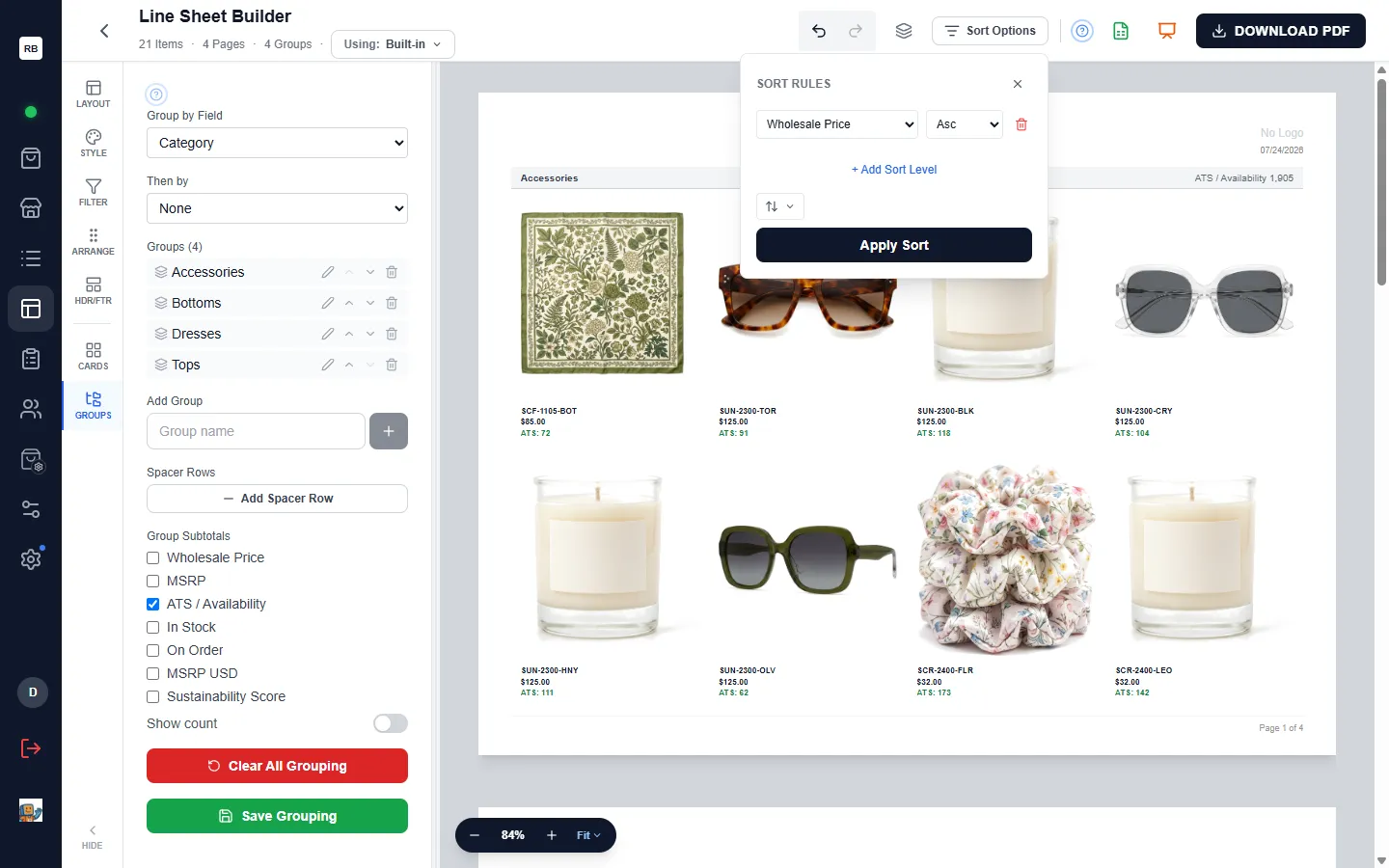
Section titled “Sort Options”The Sort Options menu controls the order of products within the document (and within each group). Add one or more sort levels — each is a field plus an Asc/Desc direction — and use + Add Sort Level to break ties by a second or third field. You can save a set of sort rules as a reusable sort preset and reload it from this same Sort Options menu later — a sort preset is just your sort order, separate from the whole-builder presets described below. Click Apply Sort to commit the order. (For how sorting and grouping work across the app, see Sorting, Grouping & Selection.)
Zooming the preview
Section titled “Zooming the preview”The pages start scaled to fill the preview pane. Use the floating zoom control at the bottom-right to change the scale:
- The − and + buttons step the zoom; clicking the percentage readout resets to 100%.
- The Fit menu offers Fit width, Fit page, and 100%.
- Hold Ctrl (or ⌘) and scroll to zoom finely.
Zoom is purely visual — it never changes the layout or what exports.
The settings rail
Section titled “The settings rail”The thin icon rail down the left edge holds one focused panel per topic. Click an icon to open its panel; click the active icon again (or the collapse chevron) to hide the panel and give the preview the full width. The builder reopens with the panel and zoom you last used.
The rail panels, in order:
| Panel | What it controls |
|---|---|
| Layout | Orientation, paper size, and the card grid (rows × columns) |
| Style | Visual styling, the font, the buyer selection, and group-header appearance |
| Filter | Which of the list’s products appear on the sheet |
| Arrange | How products reflow when you drag them |
| Header / Footer | The header and footer content |
| Cards | Which fields each card shows, or a full custom card design |
| Groups | Grouping products into titled sections |
Layout & Paper
Section titled “Layout & Paper”Choose page orientation (portrait or landscape), paper size (Letter or Tabloid), and the card grid — how many rows and columns of product cards fit on each page. The grid drives how many products land per page and how large each card is. You can see the Layout panel open in the overview screenshot at the top of this page.
The Style panel holds the visual finish of the sheet:
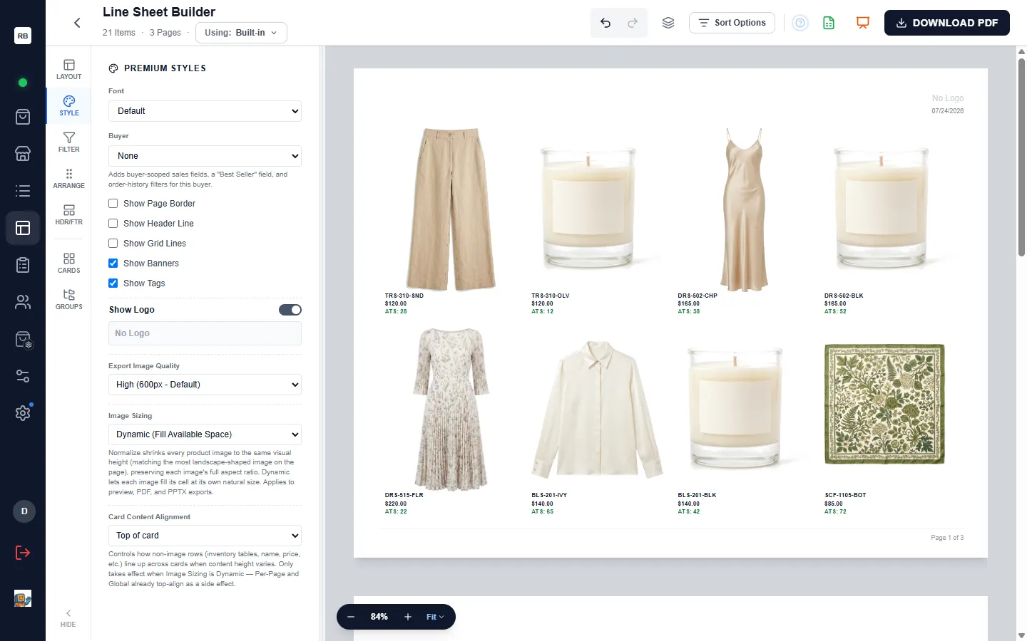
- Font — pick from a curated set of typefaces, grouped by style. The font you choose renders identically in the on-screen preview and in the PDF and PowerPoint exports, so there are no surprises when you print.
- Buyer — selecting a buyer here tailors the sheet to one customer. See Buyers and best sellers.
- Styling checkboxes — toggle the page border, header line, grid lines, and whether product banners and tags — the merchandising labels covered in The Product Detail View — print on cards.
- Show Logo — whether your company logo appears on the page.
- Export Image Quality — the resolution product images export at.
- Image Sizing — Dynamic lets each image fill its cell at its natural size; Normalize shrinks every image to the same visual height so a page of mixed portrait and landscape shots lines up. Applies to the preview, PDF, and PPTX alike.
- Card Content Alignment — how the non-image rows (name, price, inventory) line up across cards when content heights vary.
When the sheet is grouped, the Style panel gains a Group Break Style section: pick how section headings render — Bar (gray background), Banner (large and bold), Underline, or Clean (text only) — plus three page-flow options: Start Each Group on New Page, Start Each Subgroup on New Page, and Repeat Group Header on Every Page (a section that spans several pages keeps its heading — and its active sub-heading — at the top of each continuation page).
Filter
Section titled “Filter”Filters narrow which of the list’s products appear on the sheet without changing the list itself — the list keeps all its products; the sheet just hides the ones you exclude.
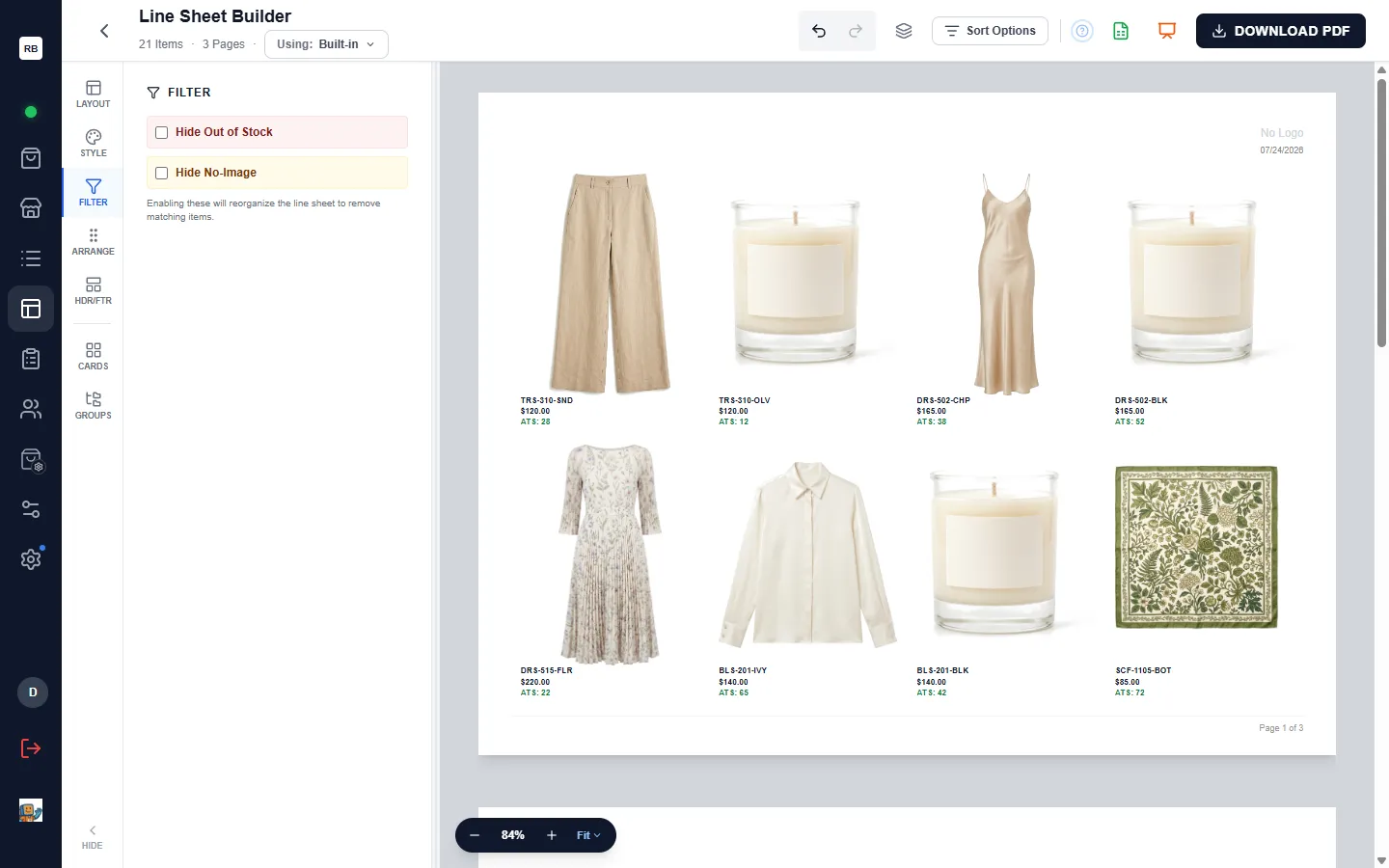
- Hide Out of Stock — drop products with no available stock.
- Hide No-Image — drop products that have no picture.
- When a buyer is selected, you can also show Best Sellers Only for that customer and filter by Buyer Order History (all products, only those the buyer has previously ordered, or only those they have never ordered).
Arrange
Section titled “Arrange”Beyond the sort menu, you can drag individual products into a custom order right in the preview. The Arrange panel sets how the layout responds when you drop a card:
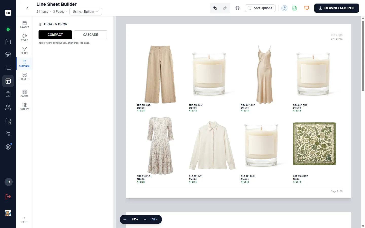
- Compact — items reflow contiguously after a drag, leaving no gaps.
- Cascade — gaps you create are preserved, and overflow spills onto the next page. (Cascade is available only when the sheet is not grouped and has no spacer rows.)
Header & Footer
Section titled “Header & Footer”Each region — the header and the footer — is split into Left, Center, and Right zones that mirror where content lands on the page. The panel also holds the sheet name field (it controls the export filename only — it does not appear on the page) and a mode select per region: show it on the first page only or on every page, with an optional different header on page one.
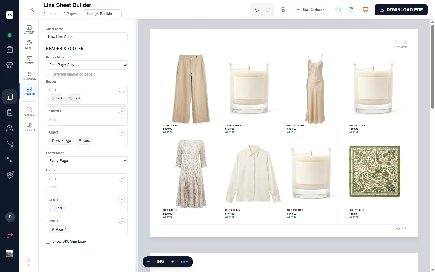
Add an element to any zone with its + button (or drag an element into it). You can insert:
- Free text — any label you type.
- Date — including a spelled-out long format.
- Page number — several formats (for example “Page 1 of 4”).
- Your company logo.
- The customer’s logo — available once the Buyers module is on and a buyer is selected.
Click an element to open its inspector, where you can edit its text, size, color, and weight, move it to another zone, reorder it, or remove it. The Show SKUMan Logo checkbox at the bottom toggles the built-in footer branding.
The Cards panel controls what each product card displays. It is a small card designer:
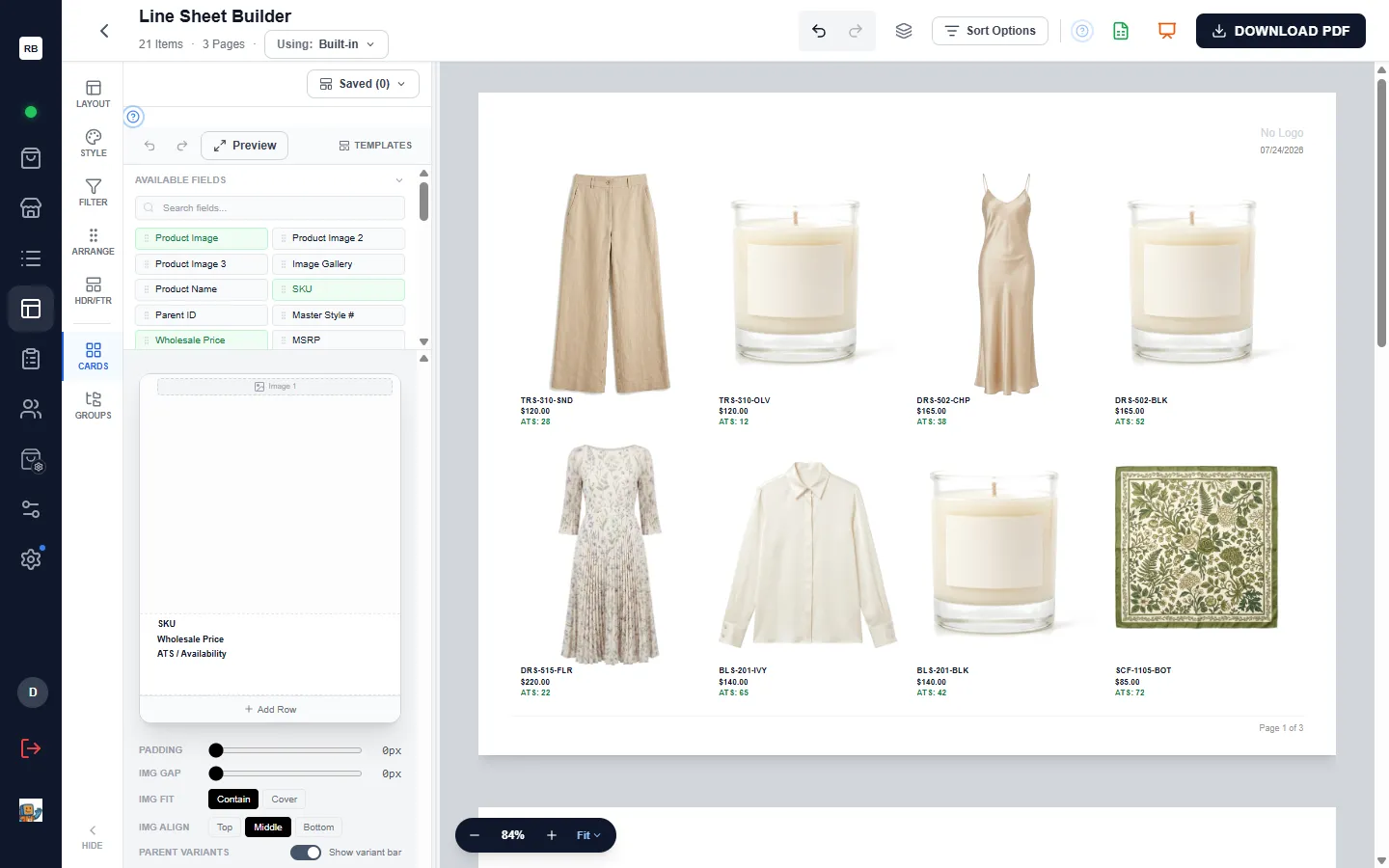
- Available Fields — a searchable bank of every field you can place: images, name, SKU, prices, inventory, and any custom fields on the source list (see Custom Fields).
- The card canvas — a live miniature of one card. Drop fields into rows, add rows with + Add Row, and drag to rearrange.
- Fine-tuning — sliders and toggles for padding, image gap, image fit (contain / cover), image alignment, and whether parent cards show the variant bar — a strip that lists the style’s sizes and their combined available stock.
- Saved / Templates — save a finished layout to reuse on other sheets, or start from a built-in template. Preview shows the design at full size.
Groups
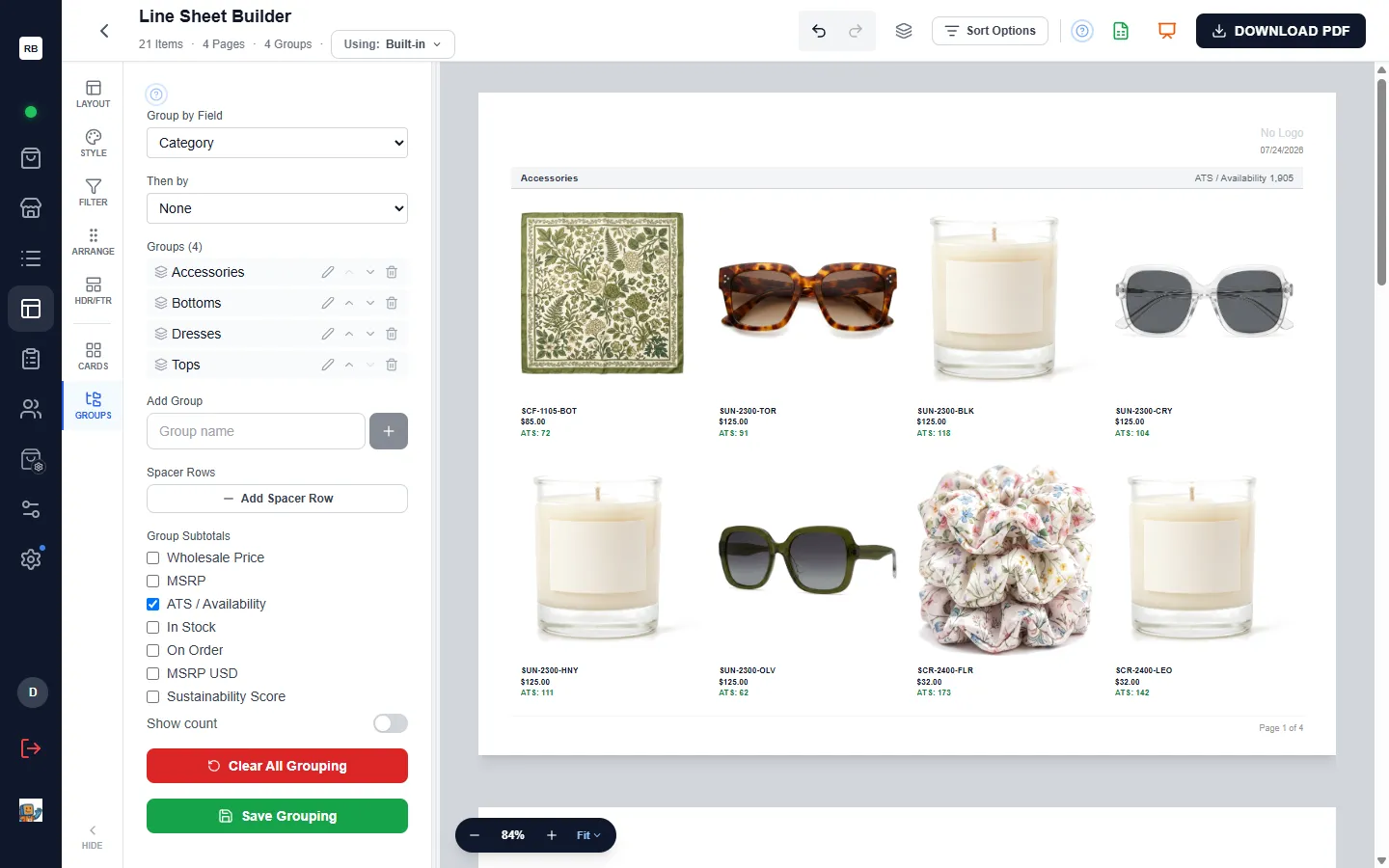
Section titled “Groups”Grouping breaks the sheet into titled sections. You can build groups two ways, and combine them:
- Group by a field — choose a field under Group by Field (brand, season, category, a custom field, and so on) and the sheet rebuilds into one section per value. Add a second Then by level to create sub-sections inside each group. Changing either field asks you to confirm, since it rebuilds the section order.
- Add manual groups — type a name under Add Group to create your own named section, then drag products into it.
Within the Groups panel you can:
- Rename any group or sub-group (pencil icon).
- Reorder groups with the up/down arrows, or delete one.
- Add per-group subtotals — tick numeric fields (such as summed order quantities, prices, or available stock) under Group Subtotals to total them in each group’s header banner, and flip Show count to add a chip with how many styles or items the group holds. (Percentage-type fields can’t be summed, so they aren’t offered.) In the screenshot above, the Accessories header shows a summed ATS / Availability chip (ATS is available to sell).
- Add spacer rows to introduce deliberate blank space between rows.
- Add a page break — hover a page and use its Insert page break before this page button (in the page-number badge cluster) to force a boundary; the break also lets you give the pages after it their own grid layout. In cascade drag mode, an Add Empty Page button below the last page inserts a blank page of empty slots.
How the section headings look — and whether each group starts on a fresh page or repeats its heading on continuation pages — is controlled from the Style panel, which gains a Group Break Style section while the sheet is grouped.
Subtotal chips appear on both group and sub-group headers, and — like the rest of the layout — render the same in the preview, PDF, and PowerPoint. Clear All Grouping returns the sheet to a flat, ungrouped layout.
Buyers and best sellers
Section titled “Buyers and best sellers”Selecting a Buyer in the Style panel tailors the whole sheet to one customer and does three things:
- The customer’s logo becomes available to the Header & Footer designer.
- Buyer-specific sales fields become available on cards — the buyer’s last and first order dates, total ordered, open quantity, order count, recent units sold, on-hand, and more. Products the buyer has never ordered show blank rather than zero.
- Best-seller badges reflect that customer, and the Filter panel gains the Best Sellers Only and order-history options described above.
These features draw on the Buyers and Inventory & Planning modules — see Buyers and Inventory & Planning.
Presets
Section titled “Presets”A preset saves an entire builder configuration — layout, style, font, cards, groups, filters, sort, and the header/footer design — so you can reapply it to any list. Presets are list-agnostic: they carry your arrangement, not the specific products.
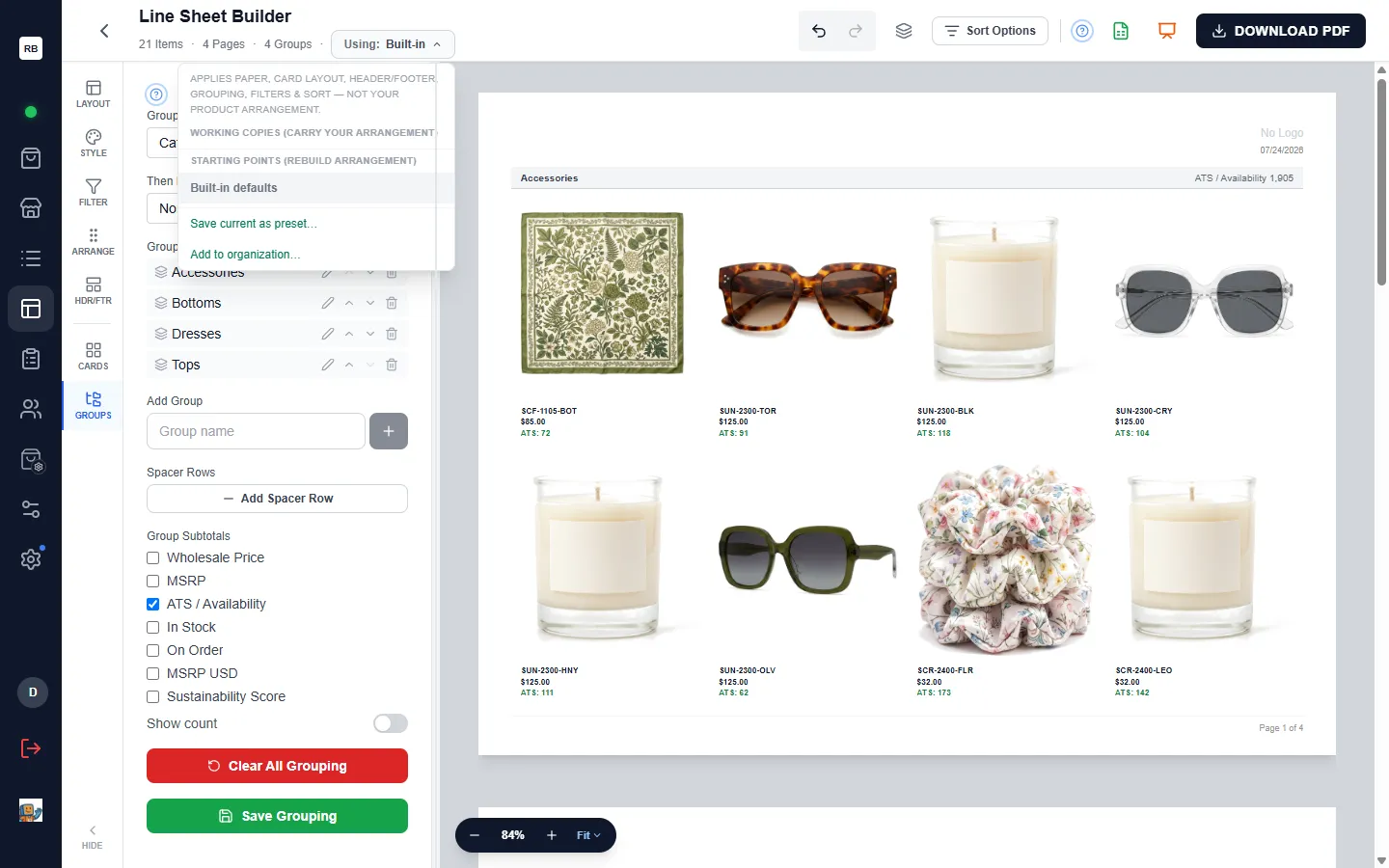
Open the preset pill in the top bar to:
- Save current as preset — store the current setup as a personal preset only you see.
- Add to organization (admins only) — publish a preset for everyone in your company.
- Set as organization default (admins only) — mark one shared preset as the starting point new sheets use.
As the menu itself notes, a preset applies the paper, card layout, header/footer, grouping, filters, and sort — not your hand-dragged product arrangement. Applying a preset restores that full configuration in one step. Organization presets can be renamed, overwritten, or deleted by admins; personal presets are yours to manage.
Exporting
Section titled “Exporting”Three export formats are available from the top bar:
- Download PDF — the print-ready document, page for page.
- PowerPoint (PPTX) — one slide per page, matching the preview.
- Excel — a structured spreadsheet of the sheet’s products that honors your grouping (group headers and subtotals carry over into the data), rather than a pixel copy of the page layout.
The PDF and PowerPoint exports are a faithful match of what you see: same layout, same fonts, same group headers and subtotals. Excel is the exception — it’s a data export built around your grouping, meant for further analysis rather than presentation.