
The Catalogue
The Catalogue is the heart of SKUMan: every product in your workspace, browsable as a visual grid or a data table, with fast search and filters that narrow each other intelligently. This page covers browsing, searching, and filtering. For sorting, grouping, and selecting products see Sorting, Grouping & Selection; for the single-product screen see The Product Detail View.
Browsing the catalogue
Section titled “Browsing the catalogue”Styles vs. individual items
Section titled “Styles vs. individual items”Products that belong to the same master style (for example, one shoe in four colors) are grouped under a single parent card. The toggle in the toolbar switches between two ways of counting your products:
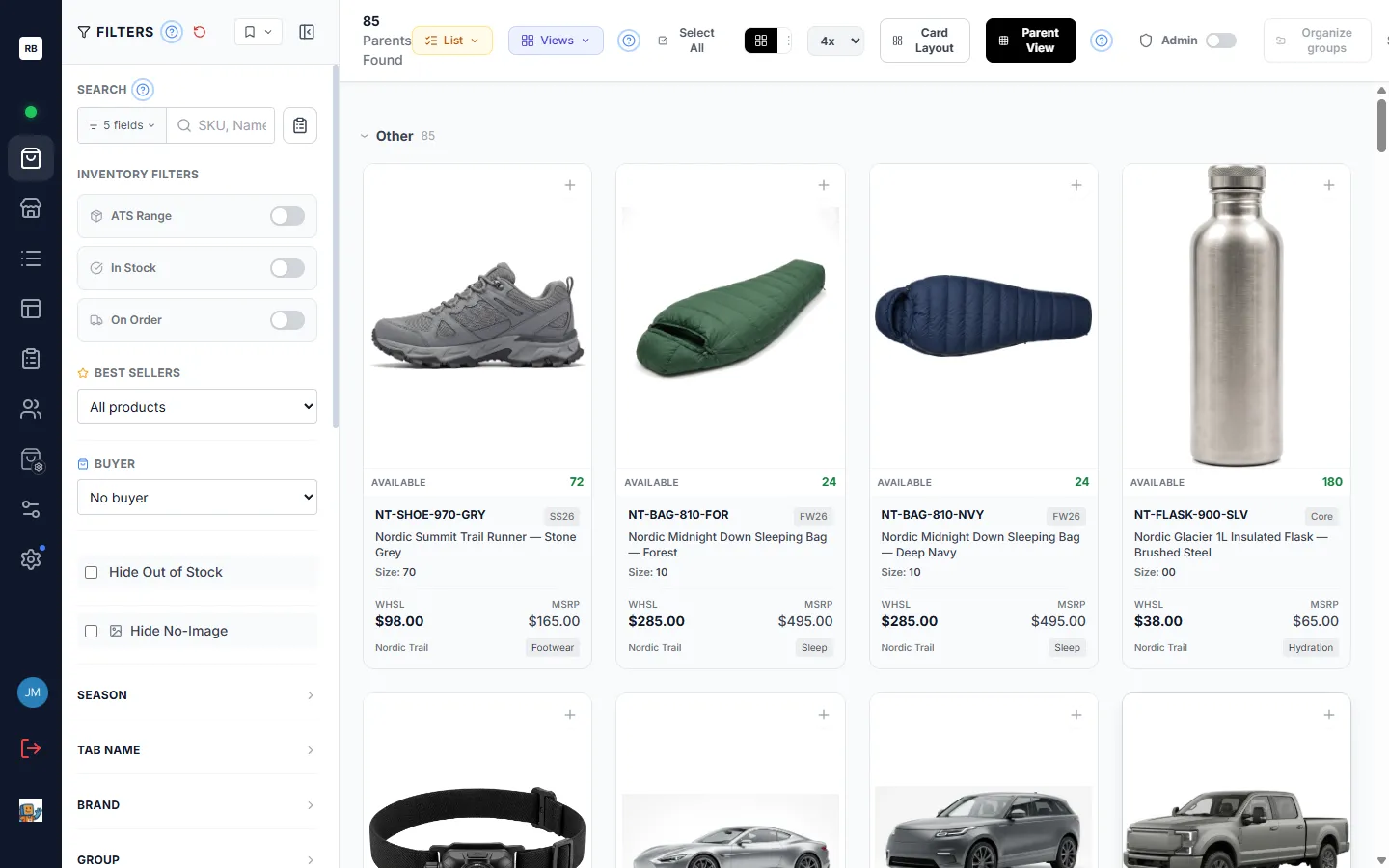
- Parent View — one card per style. The header counts the styles on screen — shown as “Parents Found,” since each parent card is one style. Availability, sizes, and prices roll up across all of the style’s variants, so a parent card shows the combined picture for the whole style.
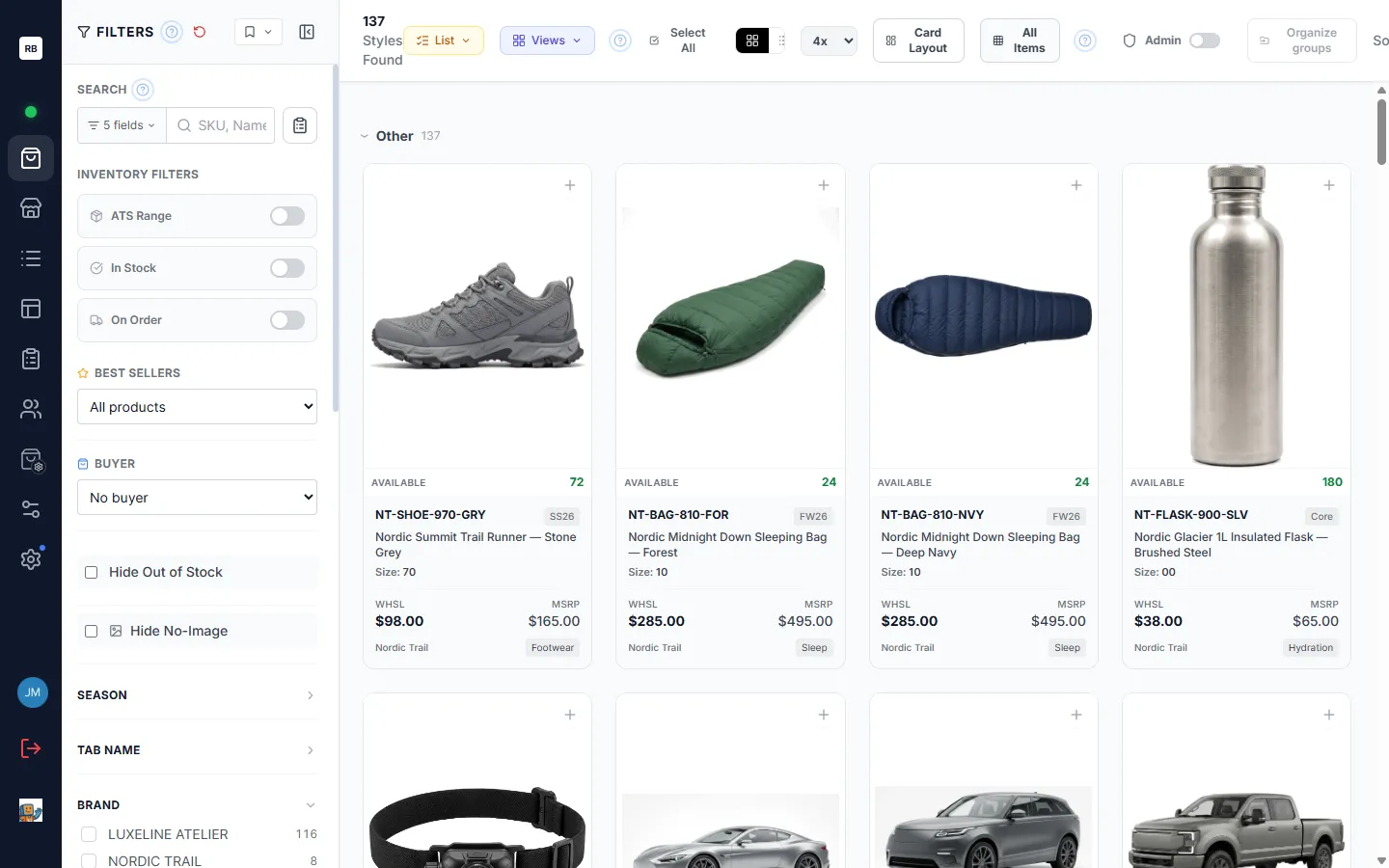
- All Items — one card per individual variant (each sellable SKU shown separately). The header counts those individual items — the label reads “Styles Found,” using style loosely for each item on screen rather than for a parent card.
Use Parent View when you are merchandising by style, and All Items when you need to see or act on each variant on its own.
Grid and list display
Section titled “Grid and list display”The Display menu in the toolbar (its button reads the current setting — for example 4× or List) switches between two displays:
- Grid — visual cards showing the product image, and whichever fields your card layout includes (SKU, name, sizes, wholesale and retail (MSRP) prices, availability, and more). The Columns row (1×–10×) controls how many columns fit across the screen; higher numbers pack in more, smaller cards. If your screen isn’t wide enough to fit a given number of columns, that choice is greyed out (“wider screen needed”). 1× is a one-card-at-a-time carousel: swipe or use the arrow keys to move between products (when grouping is on, the current product’s group path is shown in the carousel’s header), and jump anywhere with the thumbnail strip along the bottom.
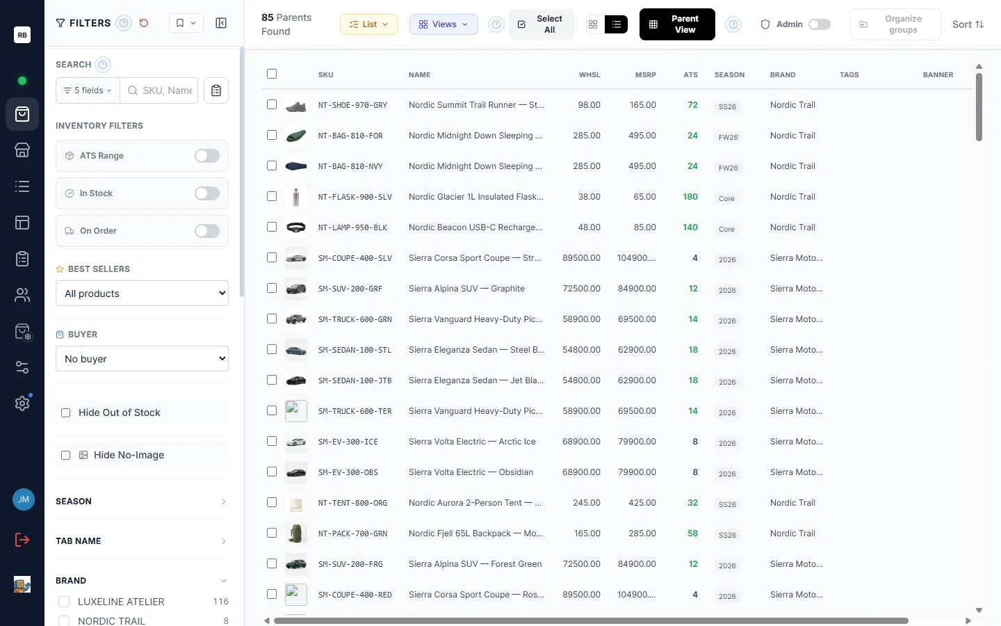
- List — a dense table with a thumbnail plus columns for SKU, name, prices, ATS, season, brand, and more. Best for scanning data across many products at once.
The toolbar
Section titled “The toolbar”The toolbar across the top of the grid holds every view control in one place:
| Control | What it does |
|---|---|
| View | One menu with three sections: Filter by list narrows the grid to the products in one or more of your lists; SKU view narrows it to a SKU View; Card Layout chooses which fields appear on the cards (admins can design and share custom layouts; everyone can pick a personal one). A badge on the button counts how many of the three are active. |
| Display | Switch between the visual card grid and the data table, and in grid mode pick how many columns fit across the screen (1×–10×). The button shows the current setting. |
| Parent View / All Items | Toggle between one card per style and one card per variant (see above). |
| Admin (admins only) | Turn on Admin Mode to reveal admin-only fields and inline editing on the cards. |
| Select All, Sort, Organize groups | Selecting, sorting, and grouping — see Sorting, Grouping & Selection. |
On a phone or a narrow window the less-used controls (Parent View, Admin, Organize groups) sit behind a ⋯ button so the bar stays a single row.
Search
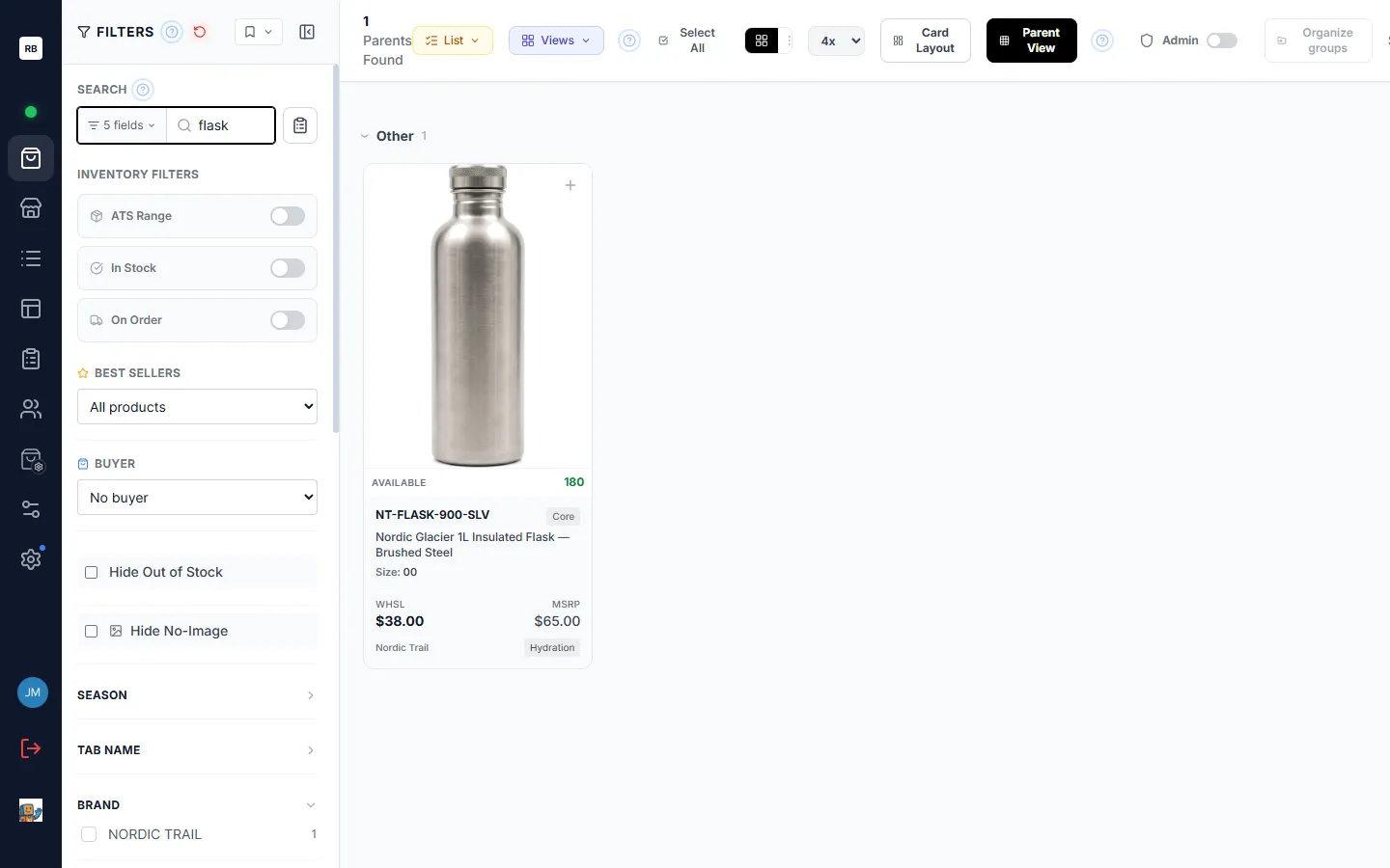
Section titled “Search”The search box lives at the top of the filter sidebar and matches as you type — results narrow with every keystroke.
Searching for several things at once
Section titled “Searching for several things at once”Type commas to run multiple searches in one box — jacket, coat shows everything
matching either term. When your query contains a comma, an Any | All switch
appears beside the box: Any (the default) shows products matching any term,
while All narrows to products matching every term — even when the terms match
different fields, so cheese, iphone in All mode finds an iPhone case from the
brand Cheese Co. One caveat: a product name that itself contains a comma (like
“Jacket, Wool”) is now treated as two terms — with Any it still appears, just among
more results, and All narrows back down.
Choosing which fields are searched
Section titled “Choosing which fields are searched”Next to the search box is a Search Fields selector that shows how many fields are currently searched (for example, “3 fields”). Open it to tick or untick individual fields — SKU, name, and other key fields — so a search only looks where you want it. It also offers quick options to select every field or reset to the defaults. By default, search covers five fields: SKU, product name, master style, parent ID, and brand.
Bulk SKU Search
Section titled “Bulk SKU Search”When you already have a list of SKUs — say, pasted from a spreadsheet or an email — use Bulk SKU Search (the clipboard button next to the search box). Paste in many SKUs at once and the grid narrows to exactly those products. While a bulk search is active, the sidebar shows “Filtering by N SKUs” with a control to clear it, and any SKUs that matched nothing appear as an orange N Not Found button next to the product count in the toolbar — click it to see the full list and copy it. Unlike the regular search box, bulk search ignores every other filter — it is a straight “find these exact SKUs” lookup.
Filters
Section titled “Filters”The left sidebar stacks several kinds of filters. They all combine — the grid shows only products that match every active filter. The one exception is Bulk SKU Search (above), which overrides the rest and shows exactly the SKUs you pasted.
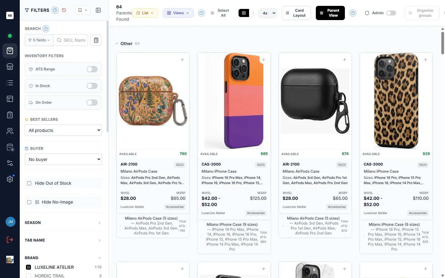
Inventory filters
Section titled “Inventory filters”An inventory card groups three numeric range filters, each with its own on/off toggle and Min/Max boxes:
- ATS Range — available to sell.
- In Stock — on-hand availability.
- On Order — quantity on order.
Turn a row on and enter a minimum, a maximum, or both to keep only products whose numbers fall in that range. (If your workspace has renamed these fields, the labels follow your names.)
Hide Out of Stock and Hide No-Image
Section titled “Hide Out of Stock and Hide No-Image”Two quick switches in the same area:
- Hide Out of Stock — drop anything with nothing available to sell.
- Hide No-Image — drop products that have no picture yet.
Best Sellers filter
Section titled “Best Sellers filter”If your workspace uses the Buyers module, a Best Sellers section lets you pick a buyer and keep only the products currently marked as best sellers for that buyer. Best-seller status is tracked per buyer, so this always reflects the buyer you choose. See Inventory & Planning for how best-seller status is set.
Buyer filter
Section titled “Buyer filter”Selecting a buyer brings that buyer’s order history onto the cards (their last order, quantities ordered, and more) and lets you filter to products they have ordered or never ordered. This section appears when both the Buyers and Inventory & Planning modules are switched on for your workspace. (This is separate from the Assigned Buyer field filter below, which simply narrows to the products assigned to the buyer you tick — it does not bring order history onto the cards.)
Field filters
Section titled “Field filters”Below the inventory filters, each product field gets its own collapsible section — Season, Brand, Group, Class, Size, Division, Assigned Buyer, and any custom fields your workspace has set up. Expand a section and tick the values you want to keep. You can drag the sections to reorder them.
Cascading filters and per-value counts
Section titled “Cascading filters and per-value counts”Two behaviors make the sidebar smart:
- Every option shows a live count — the number of products that value currently matches.
- Filters cascade. Each section only offers values that still exist within your other active filters, and searching narrows the options too. So after you pick a brand, the Season section only lists that brand’s seasons, and each count updates to match. Values you have already selected always stay visible, even if their count is zero.
Cascading is on by default. If you would rather always see the full list of every value in every section, switch it off under Settings → My Account (see Settings & Personalization). Turning it off changes only the option lists and counts — never the products shown in the grid.
Saved filter presets and clearing
Section titled “Saved filter presets and clearing”- Save a preset. The bookmark control at the top of the sidebar saves your current filter combination (and grouping) under a name, so you can reapply the whole setup later — your saved presets are listed in that same panel: click a name to load it, or its star to make it load automatically whenever you open the catalogue.
- Clear all. The reset icon next to the Filters heading clears every active filter and starts you fresh.
Filtering to a list or a SKU View
Section titled “Filtering to a list or a SKU View”The View menu in the toolbar narrows the whole catalogue to a saved collection:
- Filter by list — show only the products in one or more of your lists. Choosing a single list also unlocks that list’s per-list custom fields on the cards.
- SKU view — show only the products in a SKU View, with that view’s tags, banners, and overrides applied.
Both are quick ways to focus the catalogue without building a filter by hand.
What’s next
Section titled “What’s next”- Open a product — click any card to see its full detail, gallery, sizes, pricing, and specifications. See The Product Detail View.
- Sort, group, and select — reorder the grid, group it into collapsible sections, and select cards to act on them in bulk. See Sorting, Grouping & Selection.