
Consumer View
Consumer View presents your catalogue the way a shopper would see it in an online store — clean product cards with large imagery, retail pricing, color swatches, and a simple navigation bar. It’s built for showrooms, sales appointments, buyer meetings, and self-serve kiosk displays, and it’s completely separate from the working Catalogue you use to manage products.
Everyone in your organization can browse the storefront. The way it looks — the navigation, the home page, the colors and fonts, the product cards, and which products appear — is set up once by an admin in the storefront editor (covered at the end of this page). Consumer View is a module that an admin can turn on or off for your organization; if you don’t see it, ask your admin to enable it.
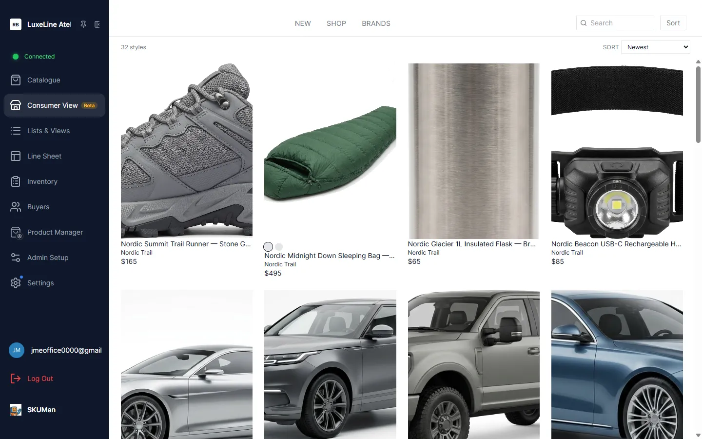
Two surfaces: Home and Browse
Section titled “Two surfaces: Home and Browse”Consumer View has two surfaces that a shopper moves between:
- Home — an optional editorial landing page (hero banners, featured collections, lookbook tiles, and more). It appears only if your admin has built one.
- Browse — the shop grid: every style laid out as product cards, with search, sort, and filters.
When a shopper opens the storefront, they land on the Home page if one has been built and has content to show; otherwise they open straight into Browse. The navigation bar and links carry them between the two.
Browsing styles
Section titled “Browsing styles”The shop grid shows one card per style (all the color and size variants of a style are collapsed into a single card), so shoppers see a tidy assortment rather than a row per SKU. Above the grid you’ll see a count of how many styles are showing (for example 137 styles).
Style cards
Section titled “Style cards”Each card is designed to feel like an online store:
- Large imagery, sized and trimmed for a clean, consistent look.
- A second image on hover — moving the pointer over a card reveals an alternate photo, the way many retail sites do.
- Retail (MSRP) pricing — the storefront shows customer-facing retail prices, not your wholesale prices.
- Color swatches — small color chips showing the style’s available colorways.
Exactly what each card displays — which fields, in what arrangement, and whether swatches appear — is part of the storefront card design your admin controls.
Search, sort, and filter
Section titled “Search, sort, and filter”Shoppers narrow the grid with three tools:
- Search — type into the search box to match styles by name and other text. As you type, the grid narrows and the available filter chips narrow to match, so you never see a filter that leads nowhere. Commas search for several things at once —
jacket, coatshows styles matching either term. - Sort — reorder the grid using the sort control.
- Filter chips — simple, clickable chips (for example a set of colors, sizes, or categories) that narrow the grid to the values you pick.
The filters shown here are the storefront’s own simplified set — they’re not the full working filters from the admin Catalogue.
Shop sections and quick-jump
Section titled “Shop sections and quick-jump”Your admin can organize the grid into labeled sections (for example by category, collection, or brand), and optionally a second level of sub-sections beneath them. Each section has a header with a chevron:
- Collapse and expand — click a section’s chevron to fold it away or open it back up. Your admin can also choose which sections start collapsed by default.
- Quick-jump chip bar — when enabled, a row of chips near the top lets you jump straight to a section. Selecting a chip scrolls to that section’s header; if the section was collapsed, it expands first.
Sections that your admin has hidden don’t just disappear as headers — their products are removed from the storefront entirely, so they won’t show up in the grid, the style count, search, or the filter chips.
Quick-shop
Section titled “Quick-shop”Clicking a card opens a quick-shop view without leaving the storefront. It shows the style’s images, its available colors, and its sizes, so a shopper (or you, in a meeting) can look over a style in detail and step back to the grid in one click.
The Home page
Section titled “The Home page”If your admin has built a Home page, it acts as an editorial front door to the storefront — the kind of landing page you’d expect from a brand’s website rather than a plain product list. It’s assembled from a set of content blocks, which can include:
- Hero banners and carousels — full-width image (or video) slides with a headline and a link into Browse.
- Featured collections and product carousels — curated rows of styles, drawn from a filter, a saved list, or a hand-picked selection.
- Lookbook and editorial tiles — image grids, mosaics, split image-and-text panels, promo strips, pull quotes, and shop-by rows of categories, brands, or color swatches.
Every block is clickable where it makes sense — a hero or a category tile carries the shopper into Browse, pre-filtered to what they tapped. Blocks that link to an outside website open it in a new tab (and are deliberately disabled while a kiosk is locked, so a display can’t be used to wander off elsewhere).
Locking the menu for kiosks
Section titled “Locking the menu for kiosks”For an unattended display — a showroom kiosk, a tablet on a stand — you can lock the app so a visitor can browse the storefront but can’t leave it. The lock is a personal, per-user setting protected by a 4-digit PIN.
Setting your PIN
Section titled “Setting your PIN”Open your account settings (Settings → My Account) and turn on the menu lock, then choose a 4-digit PIN. Two related options live there:
- Auto-lock — a toggle to lock automatically every time you open Consumer View, so you don’t have to remember to.
- Change PIN — set a new PIN later (available while the storefront isn’t actively locked).
See Settings & Personalization for where these live among your other preferences.
Locking and unlocking
Section titled “Locking and unlocking”Once a PIN is set, a Lock screen button appears in Consumer View’s left navigation sidebar; using it (or the auto-lock option) hides the app’s menu and sidebar so the storefront is all that remains, while browsing stays fully interactive. To leave, use the floating Unlock button and enter your PIN. The PIN entry masks each digit and advances automatically as you type.
If you enter the wrong PIN, the entry shakes and tells you how many attempts remain. After several wrong attempts in a row, unlocking is paused briefly before you can try again — this slows down anyone guessing at the keypad.
If you forget your PIN
Section titled “If you forget your PIN”The unlock screen has a Forgot PIN? Sign out link. Choosing it signs you out and clears the lock; when you sign back in, the storefront is unlocked and you can set a new PIN in your account settings.
The menu lock is a convenience lock for unattended browsing, not a hardened security control — treat it as a way to keep casual visitors on the storefront, not as protection for sensitive systems.
Configuring the storefront (admins only)
Section titled “Configuring the storefront (admins only)”Admins shape the entire storefront from the storefront editor, opened from Admin Setup → Consumer View (the tab appears only when the Consumer View module is enabled). At a glance, you control:
- Navigation — the top navigation bar. Entries can be manual links or dynamic menus generated automatically from a product field’s values (for example a menu of every brand or category), and you can attach a value image to each value so menus can display as text, tiles, or logos. Synthetic “leftover” buckets (like an untagged catch-all) are left out of these menus so no link leads nowhere.
- The Home page — add, arrange, and configure the editorial content blocks described above (heroes, collections, lookbook tiles, promos, quotes, shop-by rows, and so on).
- Theme — the storefront’s colors, fonts, and corner-radius/spacing, with ready-made presets you can apply as a starting point.
- Product card design — which fields appear on each style card and how they’re laid out, plus whether color swatches show, whether images are trimmed for a cleaner look, and whether the hover-to-second-image behavior is on (both default on).
- Sections — the grid’s grouping: the order of sections, renaming them, and hiding them. Hiding a section removes its products from the storefront entirely — they vanish from the grid, the style count, search, and the filter chips.
Keep configuration at this level in mind when planning a showroom: the storefront is a curated, customer-facing face of the same catalogue your team manages every day.