
Sorting, Grouping & Selection
Once you have found the products you want (see The Catalogue for search and filters), this page covers how to arrange them, pick them out, and act on them in bulk: sorting, grouping, selecting cards, the bulk actions bar, the right-click menu, hot edits, and card layouts.
The Sort menu
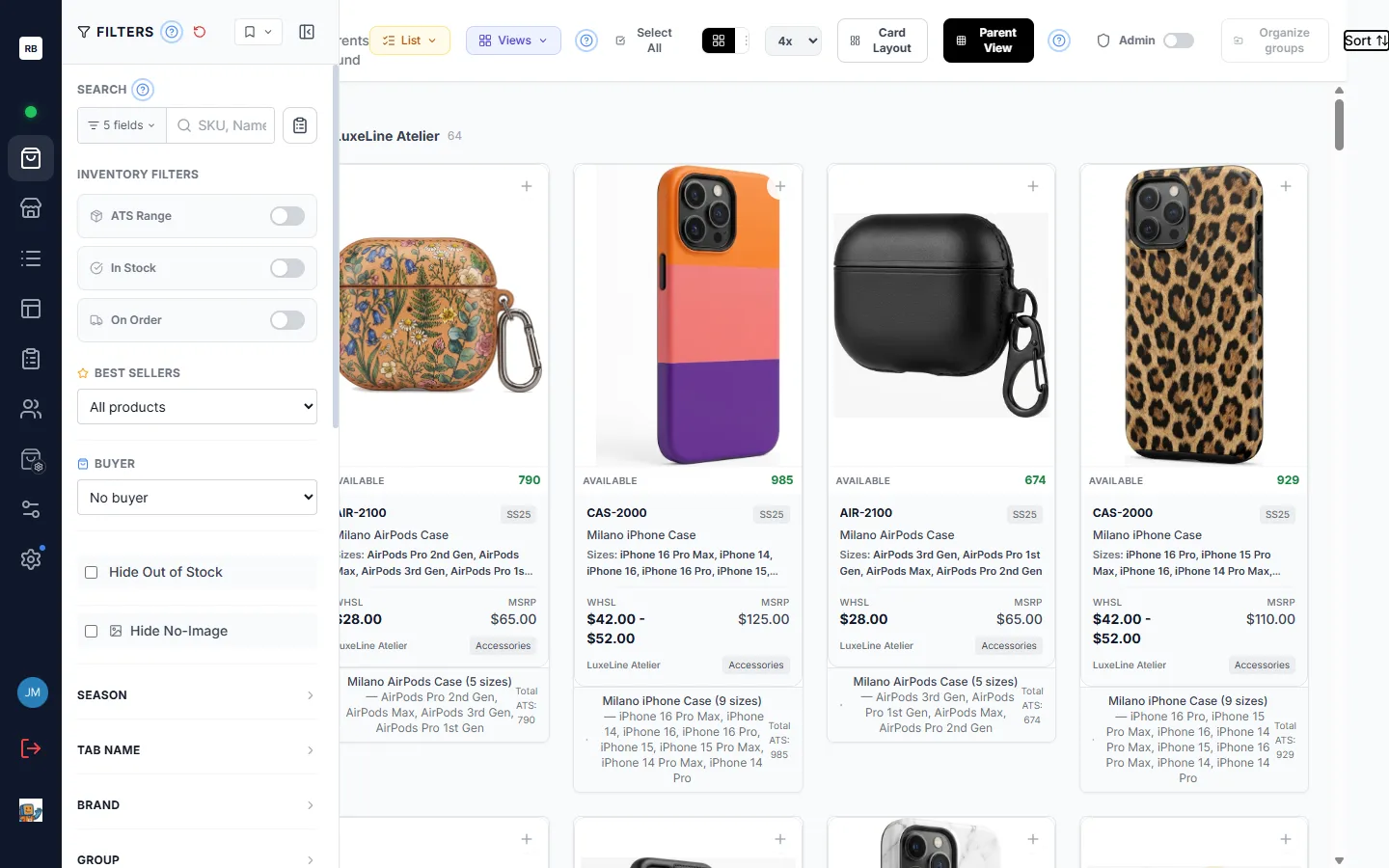
Section titled “The Sort menu”The Sort button in the catalogue toolbar (top-right, next to the view controls) opens the Sort Rules popover. Everything about ordering and grouping the grid lives here.
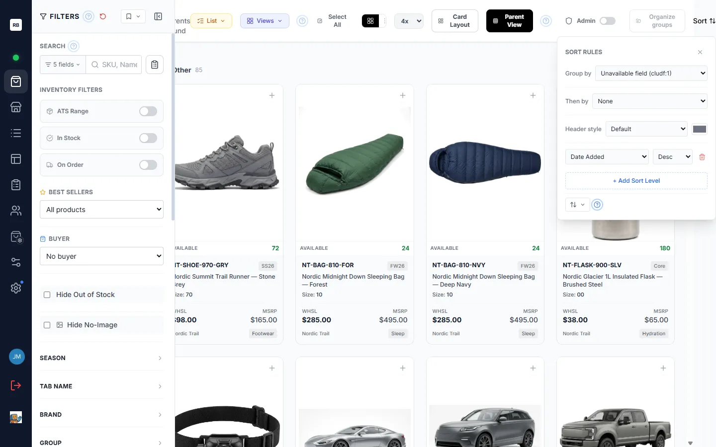
Multi-level sort rules
Section titled “Multi-level sort rules”Each sort rule has two parts: a field (brand, season, price, a custom field, and so on) and a direction — Asc (A→Z, low→high) or Desc (Z→A, high→low).
- The grid sorts by your first rule; ties are broken by the second rule, then the third, and so on.
- Click + Add Sort Level to add another rule below the last one.
- Click the trash icon at the end of a rule’s row to remove that level.
- Change a rule’s field or direction at any time from its dropdowns — the grid re-orders as you go.
For example, sort by Brand (Asc) then Wholesale Price (Desc) to list each brand’s products together, most expensive first.
Saved sort presets
Section titled “Saved sort presets”At the bottom of the popover, click the saved-sorts button (an up-and-down-arrows icon) to open the Saved Sorts panel. Click Save Current, type a name in the Sort Name box, and click Save to store your current sort rules — and, if a group is active, its grouping and header style too. Your presets are then listed in that panel: click one to reload it in a click, or click its star to set it as the default that loads automatically. Presets are personal to you. This is handy when you regularly switch between, say, a “price review” order and a “new arrivals” order.
Grouping the grid
Section titled “Grouping the grid”Grouping breaks the grid into labeled sections instead of one continuous run of cards. Grouping is also set from the Sort menu.
Group by, and Then by
Section titled “Group by, and Then by”- Group by — pick the field to divide the grid into sections (Brand, Season, a custom field, and so on). Choose None to turn grouping off. Fields that make poor buckets — like price, SKU, or product name — are not offered.
- Then by — once a primary group is active, a second Then by row appears. Pick a field here to split each section into sub-sections. For example, group by Brand, then by Season, to see each brand’s products broken out season by season. A field can only be used at one level at a time.
Header styles and accent color
Section titled “Header styles and accent color”When grouping is on, a Header style row lets you change how the section headers look:
| Style | Appearance |
|---|---|
| Default | A plain header row with the label and count. |
| Banner | A filled bar across the section. |
| Pill | The label in a rounded pill. |
| Underline | The label with an underline accent. |
Next to the style dropdown is a color swatch — pick an accent color to tint the headers. Once a color is set, a small clear (×) button appears to remove just the color while keeping the style. Choosing Default with no color returns headers to their standard look.
Group counts and collapsing
Section titled “Group counts and collapsing”- Every section header shows a count of how many cards it contains — styles in Parent View, individual items in All Items view (see The Catalogue for switching between these two views).
- Click a section header (or its chevron) to collapse it, hiding that section’s cards; click again to expand. Collapse sections you are done with to scan a long grid quickly.
Moving products between groups
Section titled “Moving products between groups”When you are grouped by one of a list’s custom fields (see Custom Fields), you can move products from one group to another right in the app — no spreadsheet round-trip. Moving a product this way simply rewrites that custom field’s value for the product, so it re-buckets into the new group instantly.
This is available to admins, or anyone with edit access to the list. Two ways to do it:
The Organize groups dialog
Section titled “The Organize groups dialog”When grouping is active, an Organize groups button appears in the toolbar. (If grouping is off it is hidden entirely; if the grouped field can’t be edited it is shown but greyed out, with a tooltip explaining why.) It opens a dialog listing the same sections you see in the grid as a single checklist:
- Tick the styles you want to move — use a section’s header checkbox to select everything in that group at once, and the search box to narrow the list by name or SKU.
- Choose a destination under Move to — an existing group, Other (clear value) to empty the field, or New group… to type a brand-new value (the section appears as soon as you click Move).
- Click Move. The grid behind the dialog re-buckets immediately and a toast confirms, for example, “Moved 4 styles to FEB”.
The dialog stays open so you can keep organizing. Moving more than 200 products asks you to confirm first.
- Mixed-value styles. When a style’s variants currently hold different values for the field, it shows an amber mixed chip. Moving it normalizes every variant to the new value.
- Undo. After a move, a one-step Undo is available (in the dialog and via the toast) to put the previous values back.
- Import instead. A footer link jumps to the CSV/Excel value importer if you would rather bulk-load values from a file — see Custom Fields.
Dragging cards onto a group header
Section titled “Dragging cards onto a group header”For a quick move, drag a card straight onto a group’s header bar and drop it there — the product moves into that group. Dragging a card that is part of your current selection moves the whole selection; dragging a parent card moves the whole style. Dropping on the Other header clears the field’s value.
The header only accepts the drop under the same conditions as the Organize groups dialog (grouped by an editable list custom field, and you have edit access) — otherwise the drop simply does nothing. Dragging a card onto a group header works even across two browser windows — drag from the catalogue in one window and drop on a header in the other. Dropping a card onto a list in the sidebar instead adds it to that list — the drop target decides what happens. A confirmation appears before moving very large batches, and an Undo is offered afterward.
Selecting products
Section titled “Selecting products”Cards in the grid select much like files in a desktop file manager. Selection works in the card grid display (it is not available in the 1× carousel or the list display — see Grid and list display — which have their own row checkboxes).
- A plain click does not select — it opens the product’s detail screen (see The Product Detail View); use the gestures below to select.
- Ctrl/Cmd-click a card to toggle it in or out of the selection.
- Shift-click a card to select the whole range between your last click and this one. Ranges add to what is already selected rather than replacing it, so a stray click never loses your work.
- Marquee drag — press on empty space between cards and drag a rectangle over the grid; every card the box touches is selected, and a small count follows your cursor. The grid auto-scrolls when you drag near an edge. Hold Ctrl/Cmd while dragging to add the swept cards to an existing selection. Press Escape to cancel a marquee.
- Select All (in the toolbar) selects every product matching your current filters and search.
- Selecting a parent card selects the whole style — all of that style’s variants come along, so anything you do next applies to the entire style.
Each card also keeps its own small select toggle — the round button in the top-right corner of the card image, which fills in blue once the card is selected — for one-off picks.
The bulk actions bar
Section titled “The bulk actions bar”As soon as anything is selected, a Selected bar appears showing the count. From it you can:
- Filter Selected — toggle the grid to show only the products you have picked (and back). Useful for reviewing a selection before acting on it. While this is on, marquee drags always add to the selection.
- Actions — a dropdown of things to do with the selection:
- Add to List — drop the selection into a list (see Lists & Views).
- Add to View — add them to a SKU View (when that feature is enabled).
- Tags and Banner — assign or clear catalogue tags and banners across the selection (catalogue management, typically for admins).
- Line Sheet — start a line sheet from the selection.
- Build Presentation — send the selection into the presentation builder (when enabled).
- Remove from List — when you are viewing an open list, take the selection out of it.
Adding to a list is a copy — your catalogue selection stays put, so you can keep working with it.
The right-click menu
Section titled “The right-click menu”Right-click any card to open a context menu with the same actions as the bulk Actions dropdown, plus Hot edit… where it applies. Right-clicking a card that is not already selected targets just that card (or its whole style, for a parent card); right-clicking within your selection acts on the whole selection.
Hot edit
Section titled “Hot edit”Hot edit writes one custom-field value across a whole selection at once — the fast way to label a handful of products after a buyer meeting, for example marking a few items “good” or “bad” under a comment field and watching the grid regroup live.
Open it from the right-click menu’s Hot edit… item (it appears only when there is a hot-editable field to write). In the dialog:
- Pick the field to write from the dropdown. If the field has an explanatory note, it shows beneath the selector. When you are grouped by a hot-editable field, that field is pre-selected.
- Choose a value — click one of the quick-pick chips, or type a new value in the free-text box. Chips include values already in use for that field, so a value you type once becomes a one-click chip next time. A Clear action empties the field instead.
- Apply writes the value to every selected product (all variants of a parent style included). The dialog stays open and your selection is kept, so you can label the next batch; an in-dialog Undo reverses the last apply. A mixed indicator warns when the selected products currently hold more than one value.
Which fields are hot-editable:
- A list’s custom fields are hot-editable by admins and anyone with edit access to that list.
- Product custom fields — the workspace-wide fields that belong to the product itself rather than to one list (see Custom Fields for the difference) — are hot-editable by admins, and only when an admin has switched that field on for hot edit.
Admin setup (admins only). In Admin Setup — the admin-only module in the left sidebar (see Getting Started) — under Custom Fields, each product custom field has a Hot edit toggle that controls whether it appears in the hot-edit dialog, plus a Notes box for a short human explanation of what the field means. Admins can also curate the quick-pick chips shown for a field — click Edit chips under the chip row in the hot-edit dialog, type a comma-separated list, and click Save chips; saving it empty returns to the automatic list.
Card Layout
Section titled “Card Layout”Card Layout, in the toolbar’s View menu, controls which fields appear on the product cards and how they are arranged. Choose it to open the card designer.
- Pick a layout. Inside the designer, open the Saved Layouts dropdown to load one of your saved designs. The menu item reads Custom (and the View button shows a badge) while a custom layout is active.
- Design a custom layout. The designer shows an Available Fields list beside a live preview of the card. Drag a field onto the card to place it (image, SKU, name, prices, inventory, custom fields, and more), drag a placed field to move it, and click a field to change its styling. Fields sit in rows and columns, so you can build the exact arrangement you want.
- Save and reuse. Save Current stores your design under a name (up to 20 personal layouts). You can overwrite or delete a saved layout, and star one as your personal default so it loads automatically when you open the catalogue. Saved layouts are personal to you.
- Share with the team (admins). Admins can make a card layout the default that everyone sees when opening a particular list, through that list’s view defaults — see Lists & Views.
For a simpler, quick set of card toggles (show SKU, season badge, wholesale price, retail price), see Settings & Personalization.